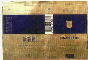
Smoke label color design basics
1. Tobacco packaging signal color (signal color)
Green: mint Yellow; flue-cured tobacco
Brown: Cigar Red: Mixed White: Special Alcohol
Commodity has a signal color. The advantages of this feature are many. Especially in the supermarket, although there is a wide range of goods, you can find out which ones you need from afar. Soon China will adopt the signal color of tobacco packaging.

2. Background
To win the consumer's approval, the background of smoke labels must meet their visual needs. The design base color generally follows the following rules.
(1) The color and marking of cigarettes are cut and adjusted;
(2) The color of the background is in harmony with the color of the main picture;
(3) The background color is consistent with the consumer's color habits.
3. Other colors
In addition to the background color, the smoke label also has a three-part color of the main figure, text and shading.
(1) The color design of the main figure
The background color of the main picture and the main picture are preferably complemented with each other, depending on the condition of the smoke tag. There are four kinds of common complementary colors that give people a completely different feeling.
1 soft tone: similar brightness, color matching; high brightness, low chroma matching. Gives a bright, soft feeling.
2 Hard Tone: Match the brightness and saturation. Gives people intense visual stimulation and personality.
3 Clear Tone: Use clear colors to create a feeling of elegance and beauty.
4 light tone: Use light tones in medium and medium colors to give people a feeling of calm and stability.
(2) Color design of text
The order of brightness between the text color and the background color is as follows: 1 black and black, 2 green, 3 white. Red characters in the ground, 4 white words, 5 yellow words, 6 red words, 7 green words, 8 black letters,
9 Red words in yellow, 10 green words in red.
Because of its long history, Chinese calligraphy, seals, and seal carvings are rich in Chinese characters. The brand names such as "China" and "Hongtai" have seen a feeling of excitement. Some designers like to decorate colors on the label. If this condition is not handled properly, it will disturb the line of sight, making the name of the label unclear and losing the readability of the label. There are also some people who like to add color enhancement to the background of the text. If it is too much, it will undermine the overall sense of the main name, leaving consumers' eyes off the label.
The principle of color design of the label is: the organic unity of eye-catching, comfort and beauty.
(3) shading color design
In the traditional design, the color of the shading is based on the elegance and softness. Through them to set off the beauty of the title and the main figure. The color of this type of decorative pattern is usually silver, gray or light yellow, and it is generally preferable to use a single color.
In recent years, due to the influence of European and American cigarette design, China's hard box cigarette markings began to use dark shades.
The design innovation of cigarette labels is often accompanied by innovations in the printing process. Printing new technologies and new breakthroughs will often be reflected first in the design of cigarette labels. This requires designers not only to pay attention to their own work, but also to pay attention to the development of the printing industry, and to keep abreast of new printing processes and new technologies. For my own use, I designed a unique style of smoke sign.
(to be continued)