The color design of carton packs is attached to graphics, text, and textures. Not only does it require beauty and generosity, it satisfies people's aesthetic requirements, and it should be highly coordinated with people's psychological feelings. Color design mainly considers the following aspects:
Color tone
The hue is the total tendency and total mood of the color arrangement on the screen. It is the main color of a group of colors, and it occupies an absolute advantage in the full screen. The packaging requires an instant visual standout on a long-distance shelf to convey product information, which requires a strong overall tone. Therefore, the key to packaging color design is tone design.
The tone design requirements are consistent with the main functions of the product. For example, red and orange notes are used for gift packaging, and cold beverage packaging is suitable and cool.
The tone design requirements and times, different regions, and different nationalities are all united in the color of the taboos. We must be able to adapt to this change and follow the trend of the times. For example, people in the Islamic region like to avoid the use of yellow in the green; Tibetans use white as their honorable color. With light yellow, green; Manchu people love yellow, purple, red, blue and avoid white. Hue design should take full account of these traditional habits to make the product popular. For export goods, packaging design should respect the customs of other countries or countries.
Color contrast
In the 12-hue circle, the colors of the two opposites are called contrasting colors, and the hue and lightness difference is the greatest, leaving a vivid and strong contrasting feeling. Only by contrast can the colors express the image correctly. The comparison mainly includes the following three aspects:
Brightness comparison: Contrast the brightness of the same hue and different hue, and need to compare them repeatedly in order to express accurately. Brightness contrast can enhance the brightness, the stronger the contrast, the clearer the visual effect, and the more blurred the visual effect.
Purity comparison: In the same color phase, the higher the purity, the brighter the color, the lower the purity, and the more turbid. Purity contrast enhances richness.
Color contrast ratio: This is the phenomenon of color shift due to the difference in hue when two or more colors are juxtaposed or alternating, and it can be divided into color contrast, complementary color contrast and cold and warm contrast. In the design of color-to-color contrast, the contrast should be just right, so that the screen is gorgeous and decent, and the Chinese are not floating, resulting in harmonious and harmonious beauty.
Color harmony
On the twelve-hue circle, two similar colors are called harmonic colors. The color harmony gives people an implicit, rich, elegant, pleasant and comfortable feeling. The main methods of reconciliation are:
Similar tones and: refers to the same color and different brightness of the color match, such as light green, bright green, dark green with light red, red, dark red with.
Approximate hue sum: refers to the combination of different colors that contain common components, such as orange, vermilion, and yellow, all of which contain yellow components and are easily coordinated.
The rhythm of color
The rhythm is an important factor that constitutes the sense of form of the picture, and it is reflected in the picture, there are many changes, such as strength and weakness, size, light and shade, rigidity and softness, height and weakness, and factuality. These two contradictory changes are not simple repetitions. It is a rhythmic movement in many forms. It has repetitions and developments. It restricts each other, advances each other, and reflects natural harmony. From the screen effect, there are fierce, stable, happy, melancholy and so on. Various colors are used to embody the same theme as an organic whole and are incorporated in the rhythm of the rhythm.
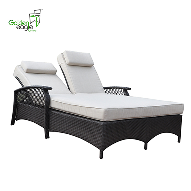
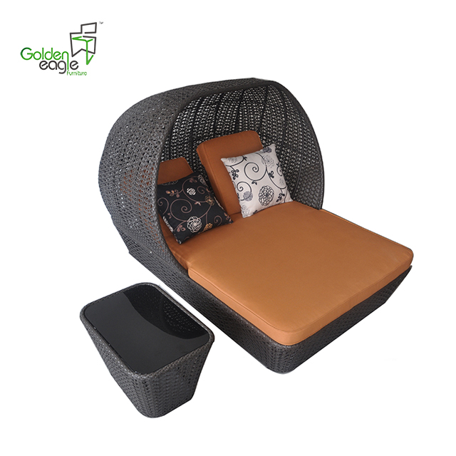
Double Beach Chair
with excellent UV resistant PE rattan weaving and alu frame, waterproof polyester or olefin fabric, double beach chair is best choice for your hotel or swimming pool. With a umbrella and a coffee or tea, you can relax in the sandbeach. engoy the sunshine with your friend and family.
Handwoven premium resin wicker UV resistant
Rust-resistant powder-coated frames
Cushions included with 30 density sofa foam
Versatile tempered glass tables
Cushions also available with 100% waterproof fabric.
Double beach chair with different style and hand weaving


If you have any questions, please contact with us directly. Outdoor Sofa Furniture are produced
by Golden Eagle Outdoor Furniture With High Quality and Good Appearance. Welcome you can visit our Factory.For any inquiry,Please send mail directly to us.
Double Beach Chair,Pe Rattan Sun Lounger,Adjustable Rattan Beach Chair,Wicker Beach Chair
Golden Eagle Outdoor Furniture Co., LTD. , https://www.geleisurefurnitures.com